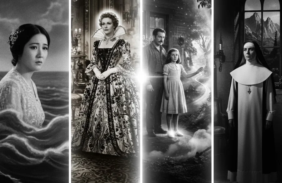
From the earliest hand-tinted frames to the digital palettes of today, color has been one of cinema’s most powerful and expressive tools. While audiences now take color for granted, its journey was a long and revolutionary one, marked by key films that didn’t just use color but redefined its artistic and technical possibilities.
These films pushed the boundaries of technology, using color to create mood, drive narrative, and build unforgettable worlds. Here are five films that fundamentally changed the way we see color on screen.
1. The Toll of the Sea (1922)
While not the first film to feature color, The Toll of the Sea was the first full-length feature to successfully use the two-color Technicolor Process 2. This subtractive process, which combined red and green hues, was a significant leap forward from earlier additive methods that required special projectors. The film, a variation on the Madame Butterfly story, showcased the potential of color to add emotional depth and spectacle to a narrative. Though the color spectrum was limited, the process demonstrated that color could be physically embedded in the film print itself, creating a consistent experience for all audiences and paving the way for color to become a viable, if still expensive, storytelling tool.
2. Becky Sharp (1935)
The true dawn of the modern color era arrived with Becky Sharp, the first feature film to be shot entirely in the revolutionary three-strip Technicolor process (Process 4). This new technology used a massive camera that exposed three separate strips of black-and-white film simultaneously through different color filters—red, green, and blue. When combined in the dye-transfer printing process, these strips could reproduce a full, vibrant spectrum of natural color. The film’s lavish costumes and sets were designed to showcase this new palette, and while the story was a standard period drama, its visual splendor demonstrated that color could be the main attraction. It was a technical and artistic breakthrough that established the “glorious Technicolor” look that would define Hollywood’s Golden Age.
3. The Wizard of Oz (1939)
If Becky Sharp was the technical proof, The Wizard of Oz was the cultural explosion. More than any film before it, it cemented the narrative and emotional power of color in the public imagination. The film’s genius lies in its iconic transition: Dorothy steps out of her sepia-toned Kansas farmhouse and into the vibrant, Technicolor world of Oz. This single moment transformed color from a novelty into a powerful storytelling device, visually separating the mundane world of reality from the magical realm of fantasy. The film’s highly saturated palette—from the Yellow Brick Road to the Emerald City and the ruby slippers (which were changed from silver in the book specifically to take advantage of Technicolor)—created a visual spectacle that left audiences breathless and became a benchmark for cinematic fantasy.
4. Black Narcissus (1947)
By the late 1940s, Technicolor was well-established, but the British directing duo Michael Powell and Emeric Pressburger, along with cinematographer Jack Cardiff, used it to achieve a new level of psychological and artistic expression. Black Narcissus tells the story of a group of Anglican nuns who establish a convent in the Himalayas, where their faith and sanity are tested by the overwhelming environment. To maintain absolute control over the film’s look, the directors famously shot the entire film on a soundstage in England, using matte paintings for the Himalayan vistas. This allowed Cardiff to use color not for realism, but as a tool to externalize the nuns’ repressed emotions and desires. The searing red used for moments of carnal pleasure and the stark whites of the nuns’ habits create a visual tension that mirrors the characters’ inner turmoil, elevating Technicolor from a tool of spectacle to one of profound psychological depth. For his work, Cardiff won an Academy Award.
5. O Brother, Where Art Thou? (2000)
Just as Technicolor defined the first era of color, the Coen Brothers’ O Brother, Where Art Thou? ushered in the next revolution: the digital intermediate. Shot by cinematographer Roger Deakins in a lush, green Mississippi summer, the directors wanted the film to have a dry, dusty, sepia-toned look that evoked old, hand-tinted postcards of the Depression era. After photochemical tests proved insufficient, the filmmakers made the groundbreaking decision to scan the entire film into a computer, digitally manipulate the color of every frame, and then record it back onto film for distribution. This was the first time a major Hollywood feature was entirely color-corrected using digital means, a process now known as the digital intermediate (DI). The film’s unique, stylized palette proved the artistic potential of digital color grading and transformed post-production, making the DI process a standard industry practice.
From the hand-tinted dreams of early cinema to the digital palettes of today, color has evolved from novelty to narrative force. Each of these films marked a turning point, reminding us that cinema’s magic has always been, quite literally, in how we see.
